Most people decide whether to approach a food truck before they can read the menu.
They clock the colors, register the name, pick up on the general vibe – and make a judgment call in about three seconds. That decision happens faster than hunger, faster than curiosity, and long before anyone has tasted anything.
That is the job branding actually does. Not making things look nice. Making that three-second read land correctly.
This guide covers what strong food truck branding looks like in practice – the logo, the wrap, the name, the signage, the merchandise, and the less obvious stuff, like why the order you make these decisions matters as much as the decisions themselves.
Key Takeaways
- Your truck’s exterior is your primary marketing asset. Every design decision should account for visibility from 50+ feet away.
- Consistency across your wrap, signage, packaging, and social presence builds recognition faster than any single element can alone.
- A name and logo are the starting point. What separates busy trucks from slow ones is a coherent identity that signals who you are before the first bite.
- Branded merchandise and community relationships extend your reach into spaces your truck cannot physically be.
- The build itself – truck dimensions, window placement, panel shape – determines what branding options are even available. Brand decisions and build decisions are not separate.
Why Strong Food Truck Branding Matters More Than It Used To
A decade ago, a distinctive truck name and a good location were enough to build a following. The market was smaller, social media was simpler, and most customers found trucks by walking past them.
That discovery path has changed.
Customers now find trucks through Instagram before they ever see them in person. They screenshot menus, follow location updates, and make plans around specific brands.
A truck without a consistent visual identity is essentially invisible to that entire discovery loop – not because the food is bad, but because there is nothing coherent to follow, share, or recognize from a thumbnail.
Strong branding also does operational work. A recognizable truck attracts customers at events and festivals without requiring active promotion. Your spot becomes a landmark. Regulars can find you across a crowded lot, and new customers understand immediately what they are about to order.
Design a Logo That Holds Up Everywhere
A food truck logo has a harder job than most. It needs to read clearly on a 10-foot vinyl wrap, shrink to a social media icon, and look right printed on a paper cup – all without changing.
Most logos that fail food trucks were not badly designed. They were designed for one context and then stretched to cover all the others.
A few principles that matter specifically for this format:
- Simplicity over detail. Fine lines, gradients, and complex illustrations fall apart at large scale and disappear at small scale. A clean shape with a limited color palette holds up across every surface.
- Bold, legible typography. Your name is the most important element on the truck. Decorative scripts can work, but only if they stay readable from the sidewalk – and they should be paired with a secondary font that is entirely clear at any size.
- Scalability testing. Before finalizing a logo, print it at the approximate scale it will appear on your wrap and pull it up as a thumbnail on your phone. If it does not read clearly in both contexts, it is not finished.
- Intentional color choices. Two to three colors, used consistently, create stronger brand recognition than a broader palette. Reds and warm oranges tend to trigger appetite associations. Greens read as fresh. Black signals premium. The colors you choose will follow you onto every surface – wrap, packaging, social media, merchandise – so it is worth making that decision deliberately rather than by preference alone.
One thing worth doing before you finalize a logo: talk to whoever is designing your wrap. Vehicle graphics have specific constraints – panel seams, rivet lines, door edges – that affect where a logo can sit and how large it can run. A logo that looks great in a design file can land awkwardly on an actual truck if those constraints were not part of the conversation.
Our post on the art of designing a custom food truck goes deeper on how those physical design decisions interact with each other.
Build a Consistent Look Across Social Media
Social media is where most potential customers will encounter your brand before they ever see your truck in person.
If your Instagram feed does not match your truck, that disconnect does quiet damage. It makes your brand feel inconsistent, which makes it feel unreliable – even if the food is excellent.
Brand consistency is not about posting frequency. It is about visual coherence. That means:
- The same color palette appearing in photos, graphics, and backgrounds
- Consistent font choices in any text overlays
- A recognizable photography style – bright and editorial, close and textural, minimal and clean – whatever it is, it should be identifiable as yours across the whole feed
- The same tone in captions and location updates as in any other customer-facing communication
The practical goal is that someone who follows you on Instagram should be able to spot your truck at a festival from across the lot and immediately connect the two.
That recognition does not happen by accident. It is built by making the same visual decisions repeatedly, across every surface, over time.
Design Signage and Menu Displays That Do Real Work
Your signage has two audiences: people who are already close enough to order, and people who are deciding whether to walk over at all.
For the close audience – the menu board:
It needs to be scannable in under 30 seconds. That means logical groupings, readable font sizes (at minimum 2 inches tall for primary items), and no visual clutter competing with the actual items.
Customers at a busy service window are often deciding quickly. A menu that requires work to read slows down the line and creates hesitation.
Digital menu boards solve some of this by allowing you to surface fewer items at once, rotate specials, and update pricing without reprinting.
Chalkboards work well for operators who change their menu regularly and want a handmade feel.
Printed boards are the lowest-cost option but require reprinting every time something changes.
For the distant audience – exterior signage:
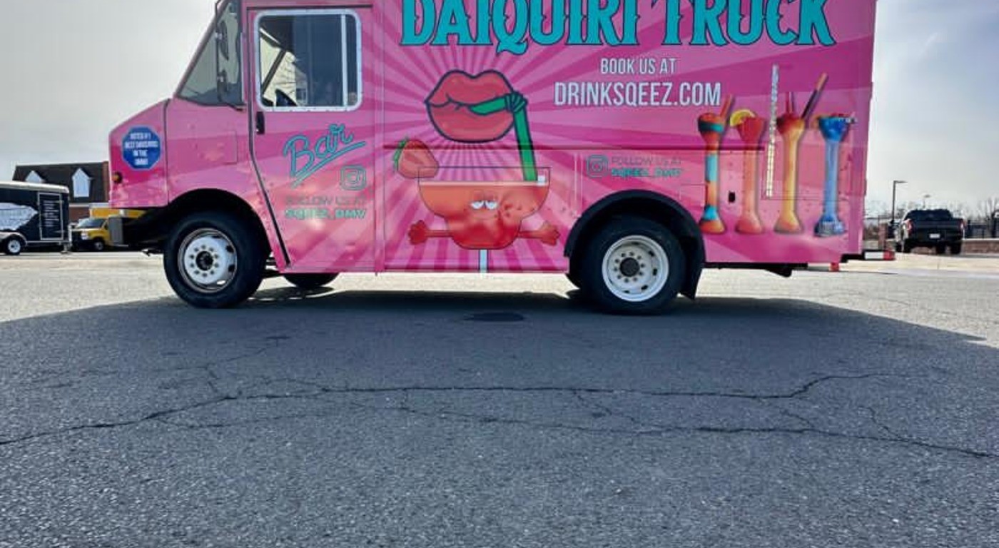
Large-format text, high-contrast color combinations, and any imagery that hints at the food all do their work from 30 to 50 feet away.
The goal at that distance is simple: communicate your name, your general food category, and enough of your personality that someone decides it is worth walking over.
One practical detail that often gets missed: if your truck has a service window that opens outward, or doors that fold back during service, test how your exterior design looks in both the open and closed positions.
Key branding elements that are partially hidden when the truck is operating are not working for you when it matters most.
Your Name Does More Than Describe the Food
Your name is the most repeated piece of branding you have.
It appears on the wrap, the social handles, the menu boards, the packaging, event listings, and every word-of-mouth recommendation you will ever receive. It also sets the tone for everything that comes after it.
A name that is too generic makes every other branding decision harder. There is less to build around, and less for customers to hold onto.
A name that is specific and slightly unexpected gives your whole identity something to anchor to.
A few things worth working through when evaluating a brand name:
- Is it easy to say and spell on the first try? Names that require correction create friction before a single transaction has happened.
- Does it hint at what you serve, or at the experience of ordering from you – without requiring explanation?
- Can it become a clean, consistent social media handle across Instagram, TikTok, and Google?
- Does it hold up visually on its own, without a tagline doing the work?
The name does not need to be clever. It needs to be useful – something that travels easily through conversation and sticks after one encounter.
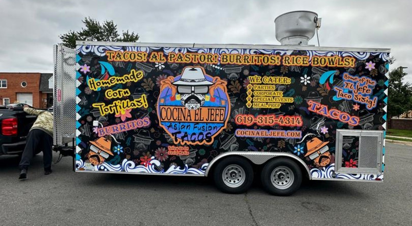
Treat Your Vehicle Wrap as Your Primary Brand Touchpoint
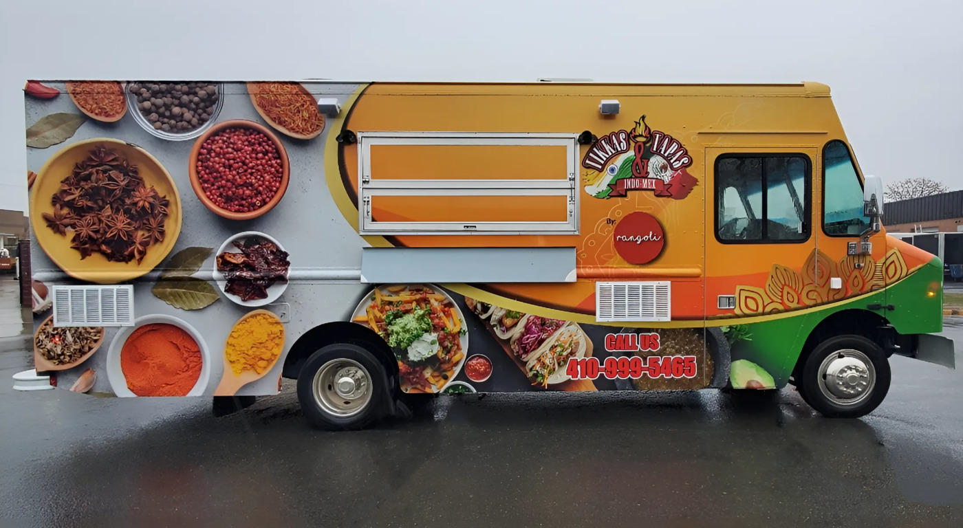
The wrap is not a finishing touch. For most food trucks, it is the highest-return marketing investment in the entire budget.
A well-executed wrap generates impressions every time the truck moves – on the highway, at a stoplight, pulling into a lot – not just when it is parked and serving.
That passive visibility is something no social media post or event listing can replicate.
What Your Wrap Is Actually Made Of – and Why It Matters
Not all wrap vinyl performs the same way.
Cast vinyl conforms more cleanly to the curves, rivets, and irregular surfaces of a truck exterior. It also holds color better under sustained sun exposure and daily service conditions.
Calendared vinyl costs less upfront but tends to lift at edges, fade faster, and require earlier replacement.
For a truck that is in regular service, the total cost of ownership usually favors cast vinyl – you replace it less often, and it looks professional longer.
If your truck is already aging and you are weighing whether a new wrap is worth it, our guide on when to upgrade your food truck covers how to think through that decision.
Designing a Wrap That Works at Every Distance
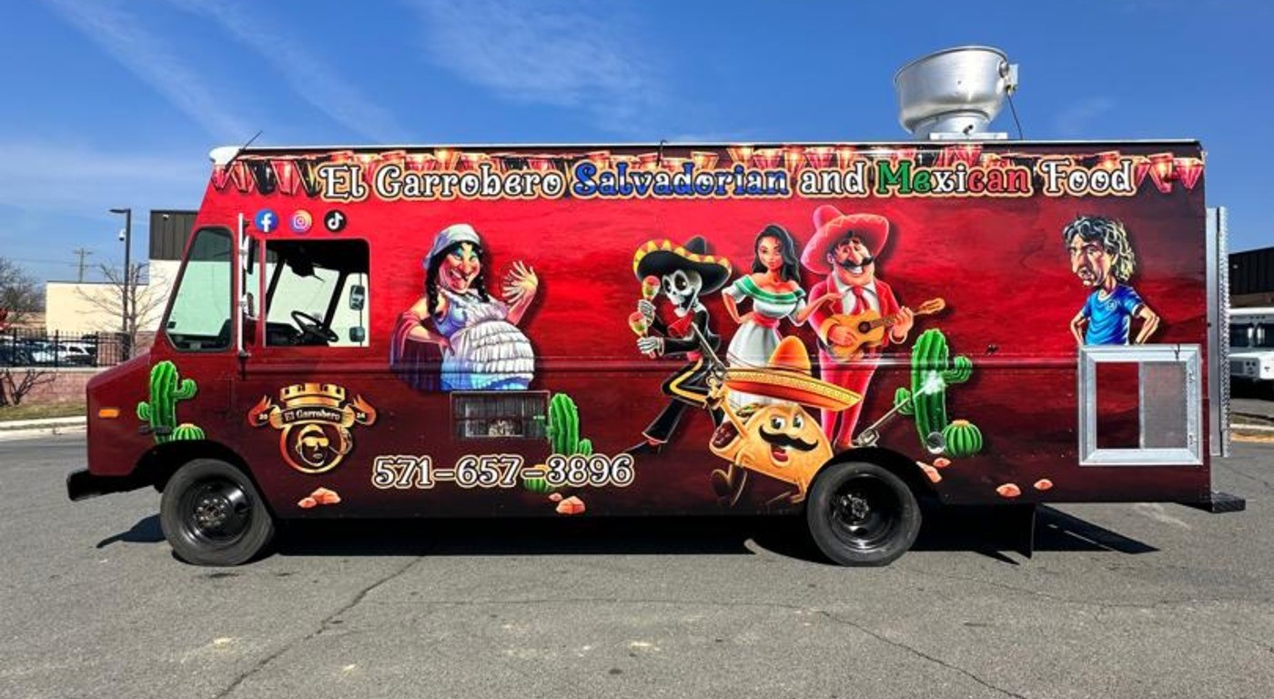
- The truck name and core visual should be legible to someone who sees it for two seconds at road speed. If it requires stopping to read, the design is not doing enough work at distance.
- High-resolution food photography, when used, should show your actual food – not stock imagery. Real photos of your best-looking items tell potential customers exactly what to expect and create appetite before anyone has spoken a word.
- Bold color contrast travels farther than detailed illustration. Complexity rewards close inspection, but contrast is what stops people from walking past.
Plan the Wrap Before You Finalize the Build
This is where most operators lose money. Wrap designs are often finalized after the truck is already built – which means the designer is working around service windows, door swings, ventilation panels, and exterior hardware that were never part of the design conversation.